Sunday, 25 November 2012
Market Research
What would you read a film magazine for?
Entertainment (characters, plot lines)
Information (history of film, actors)
0
Would you read it for information about:
Actors/directors
0
New/upcoming films
Older films
0
Characters
0
What would you like to see on the cover:
Character (in costume)
Actor (not in costume)
0
How many people would you like to see on the cover
one
0
two
0
More
||
Irrelevant- all main characters
|||
Should the cover reflect the storyline of the film it shows
Yes
|||
No
||
From this I have I gathered my magazine cover should have:
- articles about the content of other new and upcoming films
- both main actors in costume as the main feature photo
- be able to tell the film is a romantic comedy
Thursday, 22 November 2012
Magazine Layout

Tuesday, 20 November 2012
Ancillary 1- Magazine cover
For my first ancillary task, I am going to do a magazine front cover with my film as a feature in the magazine.
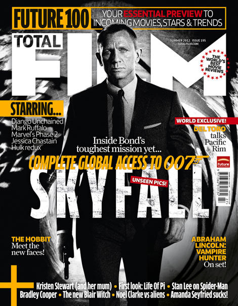
These are screen shots of the front covers of some film magazines. Empire, Total Film and Sight&Sound.
However, Sight&Sound doesn't have its own website, but has its own part of the BFI website but still fulfils the same purpose as Empire's and Total Film's website.


As you can see, all the images have the following aspects:
Sight&Sound is different to Empire and Total Film, it focuses more on the history of film and seems more of an informative magazine, opposed to the other two, which I would class as entertainment magazine.
Also, in most of the magazine covers I have seen, a bit of the feature photo overlaps the title. This makes the film look more important than the magazine, making audiences buy it for the film featured and not for the magazine. An exception to this is again, the Charlie and the Chocolate factory cover of Total Film. This may be because an close-up is used therefore the image would cover the majority of the magazine title, making people unable to read it, which is useless in marketing a magazine. Also the character's top hat is what is obstructing the text, however this is an iconic part of the character, and therefore in removing it, may make the character less recognisable. Also, in EW, although the characters head doesn't directly overlap the title, his ear does, showing they are using this alyering technique, just more subtly.
The text in the Bourne Legacy cover of Empire is slightly translucent, which makes the cover look less cluttered. In comparison to the other covers, I think Total Films has the most text and looks very busy. Empire have combated this by making some font translucent so the image can still be seen. Empire's Tintin cover is the least cluttered, this may be because Tintin was such a huge film, Empire expected readers to be drawn in just by the image and would not need any extra infomation. Sight&Sound and EW both use more simple covers and focus mainly on the content.
All images have the image source above the cover except the Bourne cover which is from
http://www.empireonline.com/gallery/image.asp?id=61792&caption=&gallery=3819
These are screen shots of the front covers of some film magazines. Empire, Total Film and Sight&Sound.
- Sight&Sound is distributed and owned by the BFI, the British Film institute.
- Empire is owned by Bauer Media who make other magazines such as Grazia, Kerrang and MCN.
- Total Film is owned by Future Publishing Ltd who also publish other magazines about cars, games consoles and other technology based things.
- Entertainment Weekly (EW) is owned by Time Inc. which is the print media brack of Time Warner. Time Inc. also own: Sports Illustrated, Fortune, People and InStyle,
However, Sight&Sound doesn't have its own website, but has its own part of the BFI website but still fulfils the same purpose as Empire's and Total Film's website.


As you can see, all the images have the following aspects:
- magazine title
- feature photo of one film/actor
- date and issue number and bar code
- name of the film corresponding to feature photo
- names of some articles inside
- names of films mentioned inside
Sight&Sound is different to Empire and Total Film, it focuses more on the history of film and seems more of an informative magazine, opposed to the other two, which I would class as entertainment magazine.
The articles in Sight&Sound are more niche and focus on older, classic films and appreciating the British talent of film making. However the other two are more of an update of what's new in the cinemas or being released with a much less strong emphasis on older, classic films. EW is a mixture of both, it focuses on the actors of the films, and the entertainment aspect, but has a more simple cover similar to Sight&Sound.
 |
| Source here |
- Also, from the appearance of the front cover of Sight&Sound, it looks more informative, with less bright colours and a more of a house style which they have matched to the actors wardrobe.
- On the other two there is a house style or colour theme present on the front cover, however, on Empire, it is much more subtle, with many shades of that colour, opposed to Sight&Sound's one shade of orange.
- On Total Films, there is less of a colour theme, besides the fact that the majority of the text is white or grey. This however may be because their feature film, Charlie and the Chocolate Factory (2005, dir. Tim Burton) is a film connoted with bright colours and being slightly eccentric, therefore if they are to give the correct idea from this film, going with contrasting colours, is appropriate. To the left there is an image of another Total Film magazine cover, one of a more serious film and it is obvious here that there is a house style individual to each issue, Charlie and the Chocolate factory is just an exception to having a colour theme to reflect the film.
All images have the image source above the cover except the Bourne cover which is from
http://www.empireonline.com/gallery/image.asp?id=61792&caption=&gallery=3819
Monday, 19 November 2012
BBFC (British Board of Film Classification)
A green screen is shown at the beginning of a trailer (and film) to show parents whether the film is suitable for their children or not. I went to the BBFC website to find out more about this.
 Below are the specifications for the main classifications, I didn't include 18 as it was obvious to me I did not meet the criteria.

 I then looked at 12A or higher films, and compared their film rating with the one given on the trailer. I found, most romantic comedies have a U rated trailer, when the film is rated 12. They may have another, higher rated trailer to give a more insightful look into the film, but if they have used a U band trailer, they can approach the largest audience. An example of this is....
On the BBFC website it states
'All theatrical advertisements, regardless of time duration, will need to be submitted for classification.
Adverts shown theatrically must display the symbol of the category awarded for a minimum of five seconds, before the work begins, or burnt into the bottom left or right corner of the frame itself.'
Although BBFC rates the films, often the screen shown is rated by MPAA ( This is shown by Submarine (2010, dir. Richard Ayoade) which is a British film, and only has limited release in the USA. However, as seen below, has the rating approved by the MPAA.
 Below are the specifications for the main classifications, I didn't include 18 as it was obvious to me I did not meet the criteria.
By looking at these specifications, I have decided my trailer is rated U. However; I think if this was to become a full length film, some milder aspects which are barely touched on in the trailer, would be elaborated more and making the film a PG or 12.

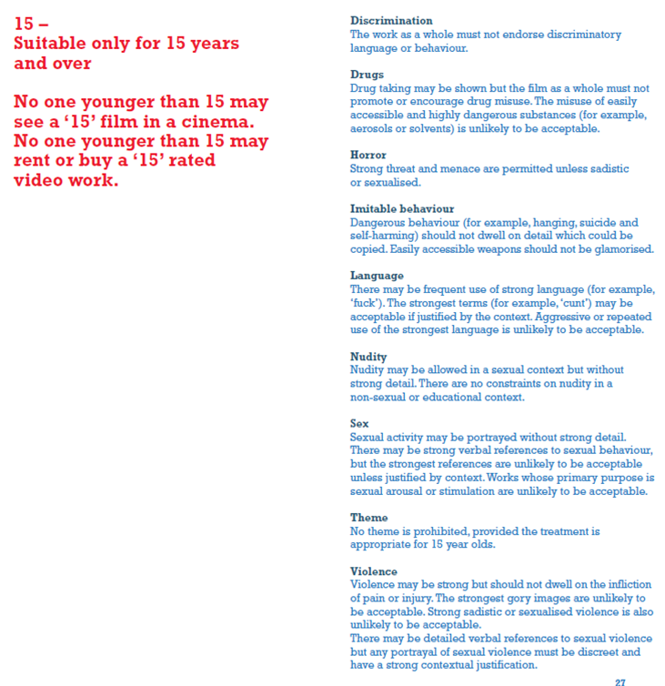 I then looked at 12A or higher films, and compared their film rating with the one given on the trailer. I found, most romantic comedies have a U rated trailer, when the film is rated 12. They may have another, higher rated trailer to give a more insightful look into the film, but if they have used a U band trailer, they can approach the largest audience. An example of this is....
On the BBFC website it states
'All theatrical advertisements, regardless of time duration, will need to be submitted for classification.
Adverts shown theatrically must display the symbol of the category awarded for a minimum of five seconds, before the work begins, or burnt into the bottom left or right corner of the frame itself.'
 |
| This is the rating screen that I shall show for 5 seconds before my work. |
Although BBFC rates the films, often the screen shown is rated by MPAA ( This is shown by Submarine (2010, dir. Richard Ayoade) which is a British film, and only has limited release in the USA. However, as seen below, has the rating approved by the MPAA.
Bibliography for this post:
http://www.bbfc.co.uk/
Classification notes from downloadable PDF from http://www.bbfc.co.uk/classification/guidelines/- but also available on the same page to read.
Image from: http://www.moviemanmenzel.com/MovieTrailers.php
Classification notes from downloadable PDF from http://www.bbfc.co.uk/classification/guidelines/- but also available on the same page to read.
Image from: http://www.moviemanmenzel.com/MovieTrailers.php
Sunday, 18 November 2012


Tuesday, 13 November 2012
Production/ Distribution Companies

I then went onto research more into how trailers presented their production and distribution companies, and found all the romantic comedies I looked at; used the logo of the companies to represent them in trailers, rather than just stating the name. Below are the most common production and distribution companies; and when the companies were shown in the trailer:

From this you can see, the logos are most often shown as the opening title or straight after a shot establishing shot (6 films); or after the lead male has been introduced (2 films)
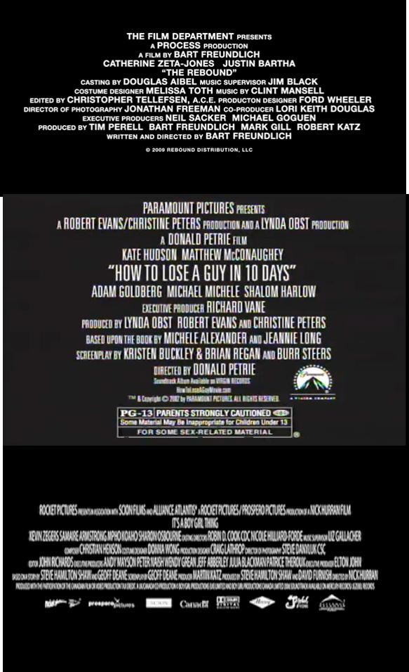
There were also 3 films where the only reference to the production and distribution companies were the end screens, which none of the other trailers had.
This may be because in the case of It's a BoyGirl thing (2006, dir. Nick Hurran) (bottom image) there is five production companies, and therefore may not fit to show all the logos of these.
In the case of The Rebound (2009, dir. Bart Freundlich), the production and distribution companies used are not very heard of and therefore may affect peoples initial judgement of the film.
From this research I have decided to make my own production and distribution company logos. The convention of these (at least in the major romantic comedy ones, above) is a grand photo, simply with the text displaced over it, with a connection between the title and image. I will therefore, use an original photo of mine and create logos for my film.
Title Screens
 These screens will be shown at the end of the film, with one comedy scene between the title of the film and the release date. I made these on Photoshop using Plantagenet Cherokee font.
I made two release date screens to match the formatting of the title screen. I put both into the trailer to see what fitted best. I decided the use the one without the Vignette as otherwise the two screens looked too similar.
 |
| One design |
 |
| Chosen Design |
Monday, 12 November 2012
Fonts
I initially went through the fonts available on the Mac and looked for any that I thought had the same connotations as a romantic comedy. The things I was looking for in the font were connotations of:

Most of these titles broke some of the conventions I was originally looking for as the bold, large, capitalised fonts that the majority of them use are not considered feminine. If I was go by the conventions I have seen and the fonts I have picked out, I think Futura or Coolvetica is the most suitable. However the styles used in 27 Dresses and Definitely, Maybe show that not all films use bold fonts, and any of the fonts chosen could be suitable. Therefore I will judge on which I think looks the best aesthetically; which I believe to be Marker Felt or Futura.
- happy
- a little feminine, but not too much
- most likely sans serif
- perhaps handwritten look

Using the research in my post Titles in Trailers, I looked at the fonts used when displaying the film title in trailers. Just My Luck (2006, dir. Donald Petrie); Made of Honour (2008, dir. Paul Weiland); She's Out of My League (2010, dir. Jim Field Smith); No Strings Attached (2011, dir. Ivan Reitman) all used sans serif fonts.
- Just My Luck uses a funky, simple font, matching with the colour choice. The smaller letter spacing in the title makes it look quite elegant as well
- Made of Honour, is more bold and striking, which matches with the capitalisation, this effects is used similarly on She's Out of My League, but with a gradient used in the font colour.
- No Strings Attached is a mixture of the two styles seen before; it is very simple, yet still gives a bold effect.
- Definitely, Maybe and 27 Dresses are both serif fonts and give a more classy, traditional look. Especially 27 Dresses which uses a contrast of colours to break up the title.
Most of these titles broke some of the conventions I was originally looking for as the bold, large, capitalised fonts that the majority of them use are not considered feminine. If I was go by the conventions I have seen and the fonts I have picked out, I think Futura or Coolvetica is the most suitable. However the styles used in 27 Dresses and Definitely, Maybe show that not all films use bold fonts, and any of the fonts chosen could be suitable. Therefore I will judge on which I think looks the best aesthetically; which I believe to be Marker Felt or Futura.
Titles in trailers

After doing research into how titles are presented in trailers from this I would chose my own
- film title
- style of presenting title
- when to present it
- how to present the release date
The above research concludes that every film I came across that the title would be present as the penultimate scene, with a verbally funny scene following it and then followed by the release date or 'coming soon' depending on how early the trailer was produced.
It also shows that all films present their title on a screen of it's own. None of them show the text over a film clip or similar, it is a still, relatively plain background.
Also in presenting the titles, a vignette style seems popular as it was used by Just My Luck and She's Out of my League. Perhaps this is because it draws attention to the title without being too obvious. I have also noted that 3 of the films researched here; the titles are capitalised. Also, Made of Honour and Definitely, Maybe have used a line design to illustrate the two halves of the title; this idea would only work with longer titles or words that could be split into two different connotations. The colours most used here is blue; then pink. Perhaps this is because these are the two main colours associated with gender, which is a prominent part in romantic comedies.
Release Date
She's Out of my League (2010, dir. Jim Field Smith) has numbers on the release date screen as a main theme of the film is numbers; this links the date to the rest of the film; as well as the phrase 'It'll all add up' above the date; suggesting all questions shall be answered according to the trailer, this is perhaps the most decorative of backgrounds used.
27 Dresses has the most prestigious look titles, this may be because the main theme of the film is weddings, which are prestigious events; this also leads to R.S.V.P above the release date, as you RSVP to a wedding invitation, using this also engages the audience as they feel 'invited' to watch the film.
To relate this aspect to my film; I could have a line similar on my end screen:
- Come along for the ride on [date]
- Stick around for [date]
Films used in this post:
Just My Luck (2006, dir. Donald Petrie)
Made of Honour (2008, dir. Paul Weiland)
She's Out of My League (2010, dir. Jim Field Smith)
No Strings Attached (2011, dir. Ivan Reitman)
Definitley, Maybe (2008, dir. Adam Brooks)
27 Dresses (2008, dir. Anne Fletcher)
Friday, 9 November 2012
Titles
I looked at some of the most successfull romantic comedies to see how they structured their title and came up with this list.
Valentine's Day (2010, dir. Garry Marshall)
When Harry Met Sally (1989, dir. Rob Reiner)
Pretty Woman (1990, Garry Marshall)
Confessions of a Shopaholic (2008, dir. PJ Hogan)
Knocked Up (2008, dir. Judd Apatow)
No Strings Attached (2011, dir. Ivan Reitman)
Leap Year (2010, dir. Anand Tucker)
Shallow Hal (2001, dir. Bobby and Peter Farrelly)
Forgetting Sarah Marshall (2008, dir. Nicholas Stoller)
Easy A (2010, dir. Will Gluck)
Rumor Has It... (2005, dir. Rob Reiner)
50 First Dates (2004, dir. Peter Segal)
4 Weddings and a Funeral (1999, dir. Mike Newell)
Love Actually (2003 dir. Richard Curtis)
Bridget Jones's Diary (2001, dir. Sharon Maguire)
(500) Days of Summer (2009, dir. Mark Webb)
Stuck With You
Being Stuck With You
Broken Journey
Broken Promotion
Broken Journey I think has too many negative connotations; although could be plausible for a romantic comedy, it sounds more like a thriller, or perhaps a parody as the two words are not normally used with each other
Broken Promotion has some of the same problems as the previous title, although does sound more like a romantic comedy, but the connotation of that suggests a 'broken heart' in result of the promotion, opposed to the actual leg. Although this allows this would surprise the audience when viewing the film, as it is purposely misleading the audience, it may put some viewers off when they realise the storyline is not as they expected.
Being Stuck with You is a better title and it highlights the main theme without drawing on the broken leg, which would be elaborated on in the trailer/film. However I think it is too wordy and my research showed that titles were on average 2 or 3 words.
I removed the 'Being' leaving me with 'Stuck With You'. This line is almost said in the trailer as the male says 'You're the one stuck with me' yet the film is portrayed from the females point of view, leaving the phrase to become 'Stuck With You'. It is a short title, and I think fits all the conventions of the titles I researched.
I did some audience feedback and the results are as followed for the title they thought was best for a romantic comedy and the results matched my reasoning.

Valentine's Day (2010, dir. Garry Marshall)
When Harry Met Sally (1989, dir. Rob Reiner)
Pretty Woman (1990, Garry Marshall)
Confessions of a Shopaholic (2008, dir. PJ Hogan)
Knocked Up (2008, dir. Judd Apatow)
No Strings Attached (2011, dir. Ivan Reitman)
Leap Year (2010, dir. Anand Tucker)
Shallow Hal (2001, dir. Bobby and Peter Farrelly)
Forgetting Sarah Marshall (2008, dir. Nicholas Stoller)
Easy A (2010, dir. Will Gluck)
Rumor Has It... (2005, dir. Rob Reiner)
50 First Dates (2004, dir. Peter Segal)
4 Weddings and a Funeral (1999, dir. Mike Newell)
Love Actually (2003 dir. Richard Curtis)
Bridget Jones's Diary (2001, dir. Sharon Maguire)
(500) Days of Summer (2009, dir. Mark Webb)
- The majority of these titles contain 2 or 3 words
- Mainly focused on women
- Holidays mentioned in titles
- If a holiday is in the title, it takes up the majority of the title (4 Weddings and a Funeral, Leap Year, Valentine's Day, (500) Days of Summer )
- Few actually mention love (Love Actually, 50 First Dates, Valentines Day)
- Paying attention to looks- Shallow Hal / Pretty Woman
- First Meeting- When Harry Met Sally
- Dating- 50 First Dates
- Getting over an ex- Forgetting Sarah Marshall
- 'Friends with Benefits' - No Strings Attached
- Getting pregnant- Knocked Up
- Easy A- the word 'easy' related to relationships can mean a girl is promiscuous but 'Easy A' can be connoted to school life. However in this film the main theme is related to both, however mentions Hester Prynne's 'Scarlett Letter'; where a girl is made to wear a red 'A' to stand for adulterer
- Leap Year- The film shows the run up to 29th February and the main theme is the folklore that allows women to propose on this day
- Confessions of a Shopaholic- although 'Shopaholics' are something more connoted with women, purely from the title alone we can only be sure that the main theme is shopping.
- 4 Weddings and a Funeral- From the title alone, this film could be about any aspect of weddings or funerals, and although weddings are associated with weddings a lot; funerals not so much. This film actually looks at the dynamic relationships between friends during these five events.
Stuck With You
Being Stuck With You
Broken Journey
Broken Promotion
Broken Journey I think has too many negative connotations; although could be plausible for a romantic comedy, it sounds more like a thriller, or perhaps a parody as the two words are not normally used with each other
Broken Promotion has some of the same problems as the previous title, although does sound more like a romantic comedy, but the connotation of that suggests a 'broken heart' in result of the promotion, opposed to the actual leg. Although this allows this would surprise the audience when viewing the film, as it is purposely misleading the audience, it may put some viewers off when they realise the storyline is not as they expected.
Being Stuck with You is a better title and it highlights the main theme without drawing on the broken leg, which would be elaborated on in the trailer/film. However I think it is too wordy and my research showed that titles were on average 2 or 3 words.
I removed the 'Being' leaving me with 'Stuck With You'. This line is almost said in the trailer as the male says 'You're the one stuck with me' yet the film is portrayed from the females point of view, leaving the phrase to become 'Stuck With You'. It is a short title, and I think fits all the conventions of the titles I researched.
I did some audience feedback and the results are as followed for the title they thought was best for a romantic comedy and the results matched my reasoning.

Thursday, 8 November 2012
Filming (6)
9th November 2012
cutaway scene of male being rebellious- portraying him as drunk in the middle of the day.
Filmed in my back garden, to represent parkland, it will show it is the middle of the day due to the lighting Male looking dishevelled and hungover with empty drink bottles in his hand in daylight abondoned in the middle of the day
props: crutches
male reaching for phone
filmed at my house to provide a home atmosphere
MCU of male reaching for phone
cutaway of phone
MCU of male falling
props: phone
Car scenes
filmed on Leighton Buzzard Bypass bridge showing the car pass through the shot
birds eye shot from bridge
side shot of car driving pass filmed on a residential street in Aylesbury. Camera placed on the side of the road as car drives past.
Tuesday, 6 November 2012
Interim feedback (2)
I showed some of the target audience my film and interviewed them for feedback. I also included a few people that weren't my target audience to get a well-rounded view of how it looks more technically as a trailer.
1) Do you normally watch romantic comedies? 2) If this came on TV or similar, would you recognise it as being a film trailer?
3) Are there any parts that are particularly good? what and why..
4) is there any part that you didn't like or didn't think was very good? what and why...
5) Can you understand the storyline?
6) Is there anything that looks out of place for a romantic comedy?
7) Is the music suitable?
8) Any other comments/improvements?
This is the version of the trailer that the audience saw:
and their comments:
Saturday, 3 November 2012

Friday, 2 November 2012
Artists
From my research I found that pop music was mainly used in romantic comedies. To avoid issues with copyrights and similar, I decided to use the music of lesser known artists and those who are happy for theyre music to be used.
Alex Day is an independant musician who is happy for anyone to use his music, he sees it as free exposure if anyone wishes to use his music, so is perfectly happy to let people use it. In this video 4minutes and 52 seconds in, he states that he's happy for anyone to use his music.
Below are some tracks by Alex that I think could be possible to use within the trailer. I have used annotations on them to show which parts of the song may be suitable for the trailer.
Forever Yours- Alex Day
Forever Yours- Alex Day [Instrumental]
Good Morning Sunshine- Alex Day
Lady Godiva- Alex Day [Instrumental]
Holding On- Alex Day
Candy Floss- Alex Day
This Kiss- Alex Day [Instrumental]
Alex Day is an independant musician who is happy for anyone to use his music, he sees it as free exposure if anyone wishes to use his music, so is perfectly happy to let people use it. In this video 4minutes and 52 seconds in, he states that he's happy for anyone to use his music.
Below are some tracks by Alex that I think could be possible to use within the trailer. I have used annotations on them to show which parts of the song may be suitable for the trailer.
Forever Yours- Alex Day
- Lyrics have a general theme of friendship and travelling- similar to trailer
- fast tempo, upbeat
Forever Yours- Alex Day [Instrumental]
- at time too dark and too much bass
Good Morning Sunshine- Alex Day
- as the majority of the trailer is about dislike- perhaps in general the song is too happy
Lady Godiva- Alex Day [Instrumental]
- very vairable- some bits could work very well, whilst others may not work at all
Holding On- Alex Day
- big gaps of lyrics break the song up and allow it to be used over dialogue easier
Candy Floss- Alex Day
- in general, the song is a bit childish
- should avid speaking sections
This Kiss- Alex Day [Instrumental]
- no parts that really should be avoided, all sections fit the trailer
Subscribe to:
Comments (Atom)