
Monday, 3 December 2012

Sunday, 2 December 2012
Sunday, 25 November 2012
Market Research
What would you read a film magazine for?
Entertainment (characters, plot lines)
Information (history of film, actors)
0
Would you read it for information about:
Actors/directors
0
New/upcoming films
Older films
0
Characters
0
What would you like to see on the cover:
Character (in costume)
Actor (not in costume)
0
How many people would you like to see on the cover
one
0
two
0
More
||
Irrelevant- all main characters
|||
Should the cover reflect the storyline of the film it shows
Yes
|||
No
||
From this I have I gathered my magazine cover should have:
- articles about the content of other new and upcoming films
- both main actors in costume as the main feature photo
- be able to tell the film is a romantic comedy
Thursday, 22 November 2012
Magazine Layout

Tuesday, 20 November 2012
Ancillary 1- Magazine cover
For my first ancillary task, I am going to do a magazine front cover with my film as a feature in the magazine.
These are screen shots of the front covers of some film magazines. Empire, Total Film and Sight&Sound.
However, Sight&Sound doesn't have its own website, but has its own part of the BFI website but still fulfils the same purpose as Empire's and Total Film's website.


As you can see, all the images have the following aspects:
Sight&Sound is different to Empire and Total Film, it focuses more on the history of film and seems more of an informative magazine, opposed to the other two, which I would class as entertainment magazine.
Also, in most of the magazine covers I have seen, a bit of the feature photo overlaps the title. This makes the film look more important than the magazine, making audiences buy it for the film featured and not for the magazine. An exception to this is again, the Charlie and the Chocolate factory cover of Total Film. This may be because an close-up is used therefore the image would cover the majority of the magazine title, making people unable to read it, which is useless in marketing a magazine. Also the character's top hat is what is obstructing the text, however this is an iconic part of the character, and therefore in removing it, may make the character less recognisable. Also, in EW, although the characters head doesn't directly overlap the title, his ear does, showing they are using this alyering technique, just more subtly.
The text in the Bourne Legacy cover of Empire is slightly translucent, which makes the cover look less cluttered. In comparison to the other covers, I think Total Films has the most text and looks very busy. Empire have combated this by making some font translucent so the image can still be seen. Empire's Tintin cover is the least cluttered, this may be because Tintin was such a huge film, Empire expected readers to be drawn in just by the image and would not need any extra infomation. Sight&Sound and EW both use more simple covers and focus mainly on the content.
All images have the image source above the cover except the Bourne cover which is from
http://www.empireonline.com/gallery/image.asp?id=61792&caption=&gallery=3819
These are screen shots of the front covers of some film magazines. Empire, Total Film and Sight&Sound.
- Sight&Sound is distributed and owned by the BFI, the British Film institute.
- Empire is owned by Bauer Media who make other magazines such as Grazia, Kerrang and MCN.
- Total Film is owned by Future Publishing Ltd who also publish other magazines about cars, games consoles and other technology based things.
- Entertainment Weekly (EW) is owned by Time Inc. which is the print media brack of Time Warner. Time Inc. also own: Sports Illustrated, Fortune, People and InStyle,
However, Sight&Sound doesn't have its own website, but has its own part of the BFI website but still fulfils the same purpose as Empire's and Total Film's website.


As you can see, all the images have the following aspects:
- magazine title
- feature photo of one film/actor
- date and issue number and bar code
- name of the film corresponding to feature photo
- names of some articles inside
- names of films mentioned inside
Sight&Sound is different to Empire and Total Film, it focuses more on the history of film and seems more of an informative magazine, opposed to the other two, which I would class as entertainment magazine.
The articles in Sight&Sound are more niche and focus on older, classic films and appreciating the British talent of film making. However the other two are more of an update of what's new in the cinemas or being released with a much less strong emphasis on older, classic films. EW is a mixture of both, it focuses on the actors of the films, and the entertainment aspect, but has a more simple cover similar to Sight&Sound.
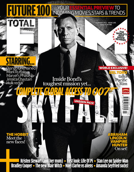 |
| Source here |
- Also, from the appearance of the front cover of Sight&Sound, it looks more informative, with less bright colours and a more of a house style which they have matched to the actors wardrobe.
- On the other two there is a house style or colour theme present on the front cover, however, on Empire, it is much more subtle, with many shades of that colour, opposed to Sight&Sound's one shade of orange.
- On Total Films, there is less of a colour theme, besides the fact that the majority of the text is white or grey. This however may be because their feature film, Charlie and the Chocolate Factory (2005, dir. Tim Burton) is a film connoted with bright colours and being slightly eccentric, therefore if they are to give the correct idea from this film, going with contrasting colours, is appropriate. To the left there is an image of another Total Film magazine cover, one of a more serious film and it is obvious here that there is a house style individual to each issue, Charlie and the Chocolate factory is just an exception to having a colour theme to reflect the film.
All images have the image source above the cover except the Bourne cover which is from
http://www.empireonline.com/gallery/image.asp?id=61792&caption=&gallery=3819
Subscribe to:
Posts (Atom)